


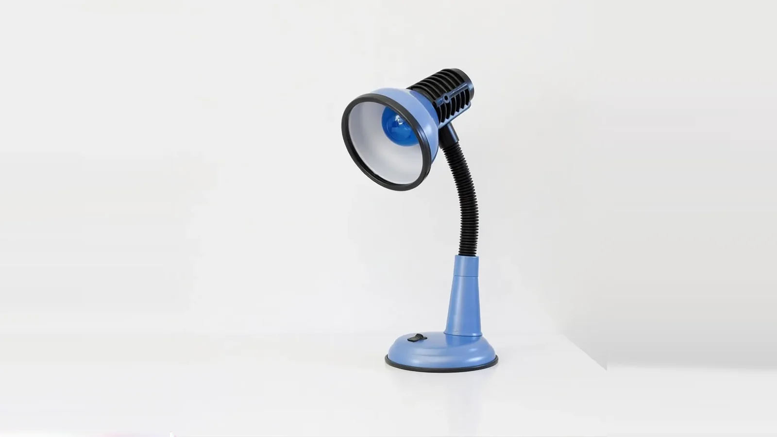
Screens live in the real world: sunlit rooms, cheap panels, ageing eyes. Designing for low vision starts with respecting light.
Contrast is your insurance against glare
A ratio that barely passes in a dark office fails on a train at noon. We design comfortably above the AA minimums so real-world light has room to eat into the margin.
Do not fight user overrides
High-contrast modes, forced colours and custom stylesheets are how many low-vision users read the web. Layouts here are tested with forced-colors mode on, not just the default palette.
Text you can enlarge without punishment
Zoom to 400% and the layout should reflow, not amputate. Fluid type and a single column under pressure keep every word reachable.
