See the blocks in action
How to try these demos with your keyboard
- TabMove into a demo (focus is always visible).
- ←→Previous / next slide.
- HomeEndFirst / last slide.
- SpacePause or play autoplay.
Hero - Editorial


Hero - Soft (autoplay, reading-time paced)
This one auto-advances, but each slide now stays on screen long enough to read its own text (reading-time pacing), and the pause control is always available. It also pauses on hover and on focus.
Hero - Minimal
New: titled navigation and reader-friendly modes
The latest version adds options a site owner can switch on per carousel. The hero below uses a titled tab list instead of dots - each button shows the slide's own heading, which is far easier to recognise and remember than a row of identical circles. Above it you will find two visitor buttons: "View as list" unfolds the whole carousel into a plain, static vertical list for anyone who would rather read everything at once, and "Easier reading" increases letter, word and line spacing and left-aligns the text for a dyslexia-friendly view. A "Skip carousel" link (visible when you tab to it) lets keyboard users jump straight past. All three are optional and off by default.
Two accessible blocks, six designed patterns
The plugin gives you two blocks. The hero carousel is for large, attention-leading slides with a heading, short text and a call to action. The card scroller is a native scroll-snap row of cards that works with touch, trackpad and keyboard alike. Both share the same design controls - colours, typography, borders, spacing and button styles - so you can match your theme without writing a line of CSS. An in-editor Accessibility check gives you a live WCAG contrast reading and warns about missing alt text or vague button text while you build.
To help you start quickly, the plugin ships with six ready-made patterns across three looks: Editorial, Soft and Minimal. Insert a pattern, swap in your own images and text, and you have a finished section in about a minute. Prefer to build from scratch? A simple layout picker lets you choose a look or start with a blank block. The card scrollers below show the same three looks.
Cards - Editorial
Cards - Soft
Cards - Minimal
New: WooCommerce Featured Products
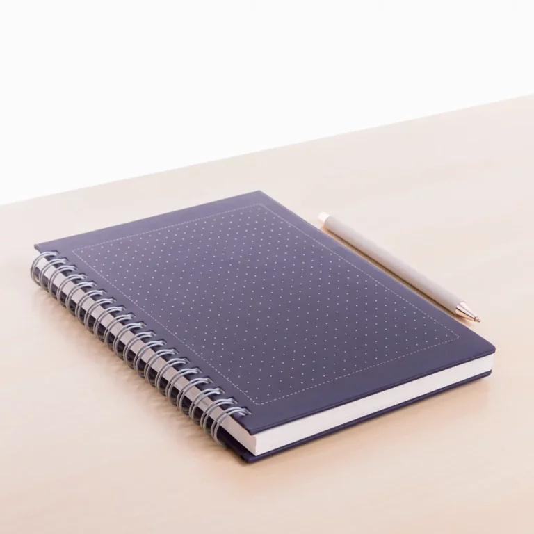
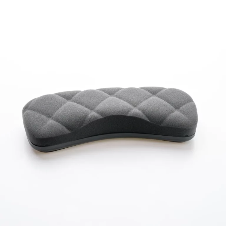
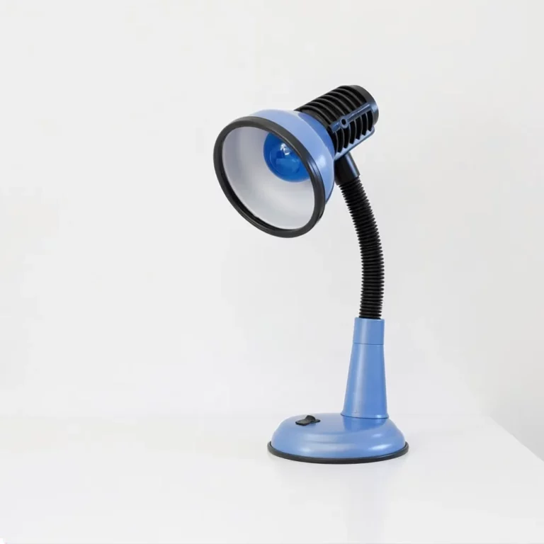
Running WooCommerce? The same two accessible components can pull the products you mark as Featured straight from your shop - shown here as a card scroller and a hero carousel. Each product becomes a card with its image, a contrast-checked category badge, the title, the price and a clearly-labelled "View" link, with the same keyboard operation, focus handling and screen-reader support as every other demo on this page.
In the editor you choose which parts of each card appear - image, badge, title, description, price and link - set the description length, order and filter the products, and pick the badge colour as Auto (always WCAG-safe) or Custom, with a live contrast check that verifies your choice on the spot. A matching shortcode is included for quick placement.
Featured products - card scroller

Featured products - hero carousel

Tested the way real people browse
Each release is checked against WCAG 2.2 AA with the tools we use every day - JAWS, NVDA, VoiceOver and TalkBack for screen readers, plus axe, Google Lighthouse and the WebAIM contrast tools. Keyboard-only testing, browser-zoom testing and Windows High Contrast (forced-colors) mode are part of the same routine. You can read more about how we approach inclusive design in our web accessibility case study, and browse more accessible block demos across this showcase site.
Because the accessible WordPress carousel uses plain, hand-written code with no build step and no third-party libraries, it stays light and predictable. There is nothing phoning home, no tracking and no cookies - just clean markup and the small script that runs it. That is what lets the same blocks pass an audit on your site as cleanly as they do here.
Frequently asked questions
Is the plugin really free?
Yes. It is published on the WordPress.org plugin directory under the GPL, with no paid tier required to use any of the blocks shown on this page.
Can visitors switch to a simpler or easier-to-read view?
If the site owner turns the options on, yes. A "View as list" button unfolds the carousel into a plain vertical list so everything can be read at once with no motion, and an "Easier reading" button widens the spacing and left-aligns the text for a dyslexia-friendly view. Both are off by default, and the extra script loads only when they are switched on.
Will it pass an accessibility audit?
It is built to WCAG 2.2 AA and tested with screen readers, keyboard-only navigation and automated tools. As always, test it within your own theme too, since a theme can affect colour contrast and focus styles around any block.
Can it show my WooCommerce products?
Yes. If WooCommerce is active, a Featured Products block shows the products you mark as Featured inside either the card scroller or the hero carousel - with the same keyboard, focus and screen-reader support. You choose which parts of each card appear, set the description length, and pick the badge colour with a live WCAG contrast check. A matching shortcode is included for quick placement.
Does it work without JavaScript?
Yes. With JavaScript disabled, each carousel becomes a simple stacked list of slides, so the content stays fully readable and no information is hidden behind a control that cannot run.
Get the accessible WordPress carousel
The plugin is available free on the WordPress.org plugin directory. Install it from your dashboard under Plugins → Add New, search for "Ananyoo Accessible Carousel", and start building inclusive sliders today. The demos above are the real blocks - try them with your keyboard, then see how the same patterns sit inside your own theme.